The original image the only thing done to it was a rotation. I ALWAYS edit the WHOLE image and save it BEFORE I crop or resize it.

My first step is to adjust my levels. What does this do? Play with the sliders/numbers and you will see. I play mostly with the midtones (the middle slider) this helps lighten up the shadows. For this image I used
0 for the black slider
97 for the midtone slider
255 for the white slider

As you can see there is a sort of haze over the image as most digital images will have especially after we lighten the midtones as we just did, so our next step is to bring out the contrast of the image.
Duplicate your layer and set it to soft light. For this image I reduced the layer to 80% this varies from one image to the next. Some I leave at 100% others 50% just depends on the lighting of the image.

Merge your layers and then duplicate it again (I try to do most of my editing in layers because I can have more control of it that way)
I like my colors to pop out and be enhanced a bit and I do this with Hue/Saturation/Lightness. With this step you have to be careful not to do too much your Reds are going to be enhanced the most and you don't want to pop them too much. My settings for this image were as follows and I left my opacity at 100% again this depends on the image sometimes I will drop it down to 20% rarely do I leave it at 100% but this image it works for.
Hue: 2
Sat: 20
Lightness: 0

As far as adjusting the color image I would leave it at this step, but to add a little extra umph to the image we will continue on a bit.
First I straightened the image a bit. In PSP I have a "Straighten Tool" that is very easy to use-it straightens and crops it straight, but I am not sure if PS has one so if you can't find one just rotate the image until the lines are straight and then crop where the image needs it.

We are now going to improve our composition by pulling his face out of the center and up into the frame a little bit. We do this by cropping and we are going to crop to an 8x10. My crop tool has a drop down menu where I can choose what size I want my image to be and then it will keep that ratio.

I didn't like the little wrinkle in his jeans of his left leg and I also wanted to get rid of some of his back so it did not look so big. Notice by doing this simple crop your eyes are more drawn to his face.
Now we burn to also help bring more emphasis to his face. My burn settings are
Hardness: 14
Step: 10
Density: 100
Thickness: 100
Opacity: 28
I burned everything but his skin and lowered the opacity to 85%

I also soften the background a bit more too mostly the wall and the rocks-I use my soften brush which for me is found where the burn brush is.

To pop the color a bit more you can repeat the H/S/L step again and here I reduced it to 45% and tada here is my colored image complete, now on to the black and white.

The key to a good black and white is a good colored image so always edit your colored image first and then convert it.
I use Hue/Sat/Lighten for my conversion. Make sure that "colorize" is checked and my settings are
Hue: 14
Sat: 6
Light: 0

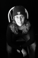
Notice how lifeless and flat the black and white is at this level, the skin tones are so gray and boring. Sadly all too often this is where a black and white is left. We are going to take it further though and improve it.

Duplicate your layer and go to levels (I use the same settings as above) lower your opacity down to 40%-because of his fair hair and skin it is not necessary to lighten it up much so with a different subject you might have to raise the opacity more.
Now we have a lighter image that is quite flat still. So we dup the layer and do another soft light layer to it. Since in this case the image was quite flat I left my opacity at 75%

Notice the difference? I like to warm up my images just a tad and do this with curves (I do know that in PS elements you do this in levels) I select the red and green channels and grab a point in the middle and raise it just slightly to your liking.
and there we have it a black and white image and since we did all the little editing with the colored image it is done now. Although I do like to add a little more burning to it-using the same settings as above.

Okay so I forgot to resize the images so I will come back later this week and resize them so when you click on them they are not so HUGE!
No comments:
Post a Comment